Thursday, 26 September 2013

AW : Print Analysis 2 of Plan B - The Defamation of Strickland Banks


Advertisment

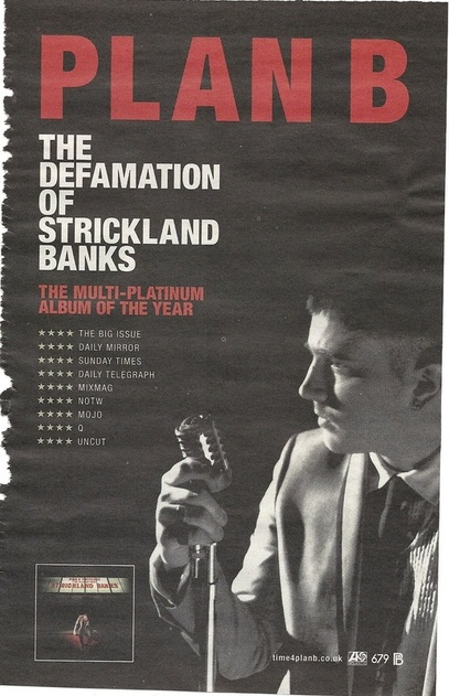
This is a magazine advert for UK rap artist Plan B, despite this album being more experimental for Plan B and is less of a rap album and more soulful and jazz based, the meta-narrative of the artist still remains with him being vert 'street' and 'hip'. The advert shows a very simple colour scheme with a large image of the star to the right in black and white, as not to take away from the greyscale and red colourscheme. The advertisment again portrays all of the relevant information, the artist name in bold red text, subtitled by the title of the album. Also included are reviews of the album by highly regarded newspapers and magazines, as this advert would most likely be published in a mainstream magazine these reviews are so people can see a change in the style they may be familiar with when they hear the name 'Plan B'. There is also an image of the album at the bottom, so people unfamiliar with the artist will be able to recognise the CD if they see it.
 

Album Cover

The album cover sticks with the black, red and white colour scheme, bearing connotations to the old 60's style soul singers in their black suits with a red tie. We also see Plan B sitting on the edge of a stage, with a 20th century theatle listing board, with his name and the album title on, denoting that he is the star of this 'show'. This continues through the narrative of the album, as it feels Plan B is telling a story through his album. The album also agree's with Richard Dyer's theory of star image (1979) that 'an artist must be both present and absent to their audience', which is shown here, with the star right in the centre of the image under a spotlight, but his astray expression and the fact he is looking at the ground make him appear absent and unfocused.


AW : Music Insitional Context


Why is a Music Video significant?


Music Videos are significant as they promote the singles that artists release, letting them enter the charts and gain popularity, with a popular music video an artist can expand their audience and sell more music.

Production Process of a music video


A director will be contacted by the studio and given a song and a budget to make a video for, they will then create a treatment and get back to the studio to be given the green light. They then have to create a schedule of times the artist is free to be filmed and when they are going to film all the other parts of the video. There is then a lengthy editing process and then the video is fed back to the studio before a deadline.

How do NMTs promote artists? To what extent is this an example of 'we media'?


New media technologies such as the internet and more specifically YouTube and Vevo have given artists a way to get their music video to a wider catchment audience than simply the music channels on television. Also they make money off of the views they receive directly rather than a TV channel making money, so the artists not only gains a wider audience, but also profits from NMTs

The Music Press promoting artists


The music press such as NME magazine and Radio 1 do play an important part in spreading music to the UK. Radio 1 uses is 'single of the week' to promote a particular song which usually ends up at number 1 in the charts, for example 'Get Lucky' by Daft Punk. However due to the wide variety of music available and the lack of interactivity in the music press, they have been criticized for not being diverse enough. Caroline Sullivan of The Guardian criticised was quoted in 2012 as saying:


 "NME bands" fall within very narrow parameters. In the 80s, the paper prided itself on its  coverage of hip hop, R&B and the emerging dance scene which it took seriously and featured prominently – alongside the usual Peel-endorsed indie fare. Now, though, its range of approved bands has dramatically shrunk to a strand embodied by the [Arctic] Monkeys, Babyshambles and Muse – bands who you don't need specialist knowledge to write about and who are just "indie" enough to make readers feel they're part of a club. Like everything else in publishing, this particular direction must be in response to reader demand, but it doesn't half make for a self-limiting magazine.


AW : Technical Analysis of Madvillain - Accordion


0.00-0.08
Fade in from black, tracking out shot down a corridor, all shadows, character at the end surrounded by light
0.08-0.09
Close up, side on of artists face
0.09-0.10
Tracking shot continues from 0.00
0.10-0.11
Same as 0.08
0.11-0.12
Same as 0.09
0.12-0.13
Same as 0.08
0.14-0.15
Same shot as 0.00 but this time the camera is still
0.15-0.23
Similar shot to 0.08, zoomed out to a medium shot, man playing accordion in background, all characters are basically silhouettes
0.23-0.26
Rapper, only his mask really visible in a mid shot, we see a man and woman by a bannister in the background, narrative fuzz
0.26-0.29
MS of rapper rapping, all in same location so far just different camera positions, all eye level
0.29-0.31
Zoom out of close up of artists face, high angle camera, in a corridor
0.31-0.35
Series of back and forth cuts of rapper in same position just from further away and then closer again
0.35-0.37
MS of rappers upper body silhouetted rapping
0.37-0.40
MLS of artist to right side of the screen, camera zooms out to show full body in a corridor
0.40-0.42
Tracking shot of artist walking down a corridor away from bannister at the end of it, revealed to be same location as the tracking shot at 0.00
0.42-0.54
Camera handheld,  eye level, artists walking towards in performance, then walks past, leaving only the woman by the bannister dancing as a silhouette in the light
0.54-0.56
Same camera style as last time just pulled back a bit more so the artist is back in frame as a MS
0.56-0.57
Artist MLS going round a corner rapping, camera follows
0.57-0.58
Less than a second, shot of artist in corridor rapping MS
0.58-1.00
CU of artists mask with the microphone rapping
1.00-1.05
Silhouette of artist rapping against white wall
1.05-1.10
Artist in corridor facing away from camera, camera pans across the corridor
1.10-1.12
Still shot of  an accordion leaning against a bannister at the end of the corridor, MS
1.12-1.14
Rapper at the end of the corridor MLS rapping
1.14-1.17
Artist in a hallway, camera pans across his body fast, MLS
1.17-1.20
CU of artists face against plain white wall
1.20-1.23
Artist performing in plain white  room MCU
1.23-1.29
Artist in original open ended corridor, handicam MS
1.29-1.30
Quick shot of artist silhouette, pans across
1.30-1.35
Artist now conversing with woman in the corridor but stops to rap to camera
1.35-1.36
CU of artist looking into the ceiling of the room
1.36-1.38
Rapper in corridor walking towards camera
1.38-1.40
Artist walking away from camera MS
1.40-1.42
MCU of artist performing to camera
1.42-1.45
MCU of performance in corridor
1.45-1.52
Quick zoom of silhouette of artist performing, cannot see facial features  MLS to MS
1.52-2.00
MCU which is usually artist performing is him swaying as the camera blurs and fades to black


From technically analysing this video, I've noticed most of the performace shots are of the artist at eye level, at a MCU, cut with MLS and occasionally zooms, the camera is cleary handicammed but doesnt move very much other than slight jolts. I have also noticed the director has filmed the performace part several times in one location, and cuts betweening, giving the effect of the camera being in more than 1 place. There is also use of narrative fuzz in this video, we see a man and a woman at the end of the accordion but do not know theyre meaning or influence on the narrative. The majority of the video is performance based however, making the video very illustrative as the song is not so much a story as a quick delivery of wordplay and metaphors.
 

SH: Print analysis of Mikill Pane - Blame Miss Barclay

Mikill Pane - Blame Miss Barclay album cover
  • This, like many of Mikill Pane's other albums is very minimalistic. Typically of the genre of British rap/hip hop features the artist as the main feature.
  • The visual effects of this are the most simplistic effect of the album cover, it includes the artist standing, staring into the camera plainly and almost ironically in terms of his expression being dressed in a school uniform with an innocent look.
  • The other visual effect is the logo which has been looked to be chalked in, on the playground background, it gives the connotation of slight rebellion in a low key sort of manner as it is not a full scale piece of grafiti but it is as if he has 'left his mark'. The two visual effects, I think, are to add to his persona of his own view upon his 'ironic' innocence that he believes he has.

  • Linguistic devices in this include the artists name and the title of the album at the bottom. The artists name is writting in a straight, simple font. He also uses clever image with play on wording, for example the 'A' is a window pane. This portrays his witty persona and his clever use of word play.
  • The album title, Blame Miss Barclay, anchors his costume and his facial expression of innocence in that he is pushing his blame onto 'Miss Barclay' and the audience assumes he is blaming her for creating him as a rap artist image. It also creates a link to the chalk logo which seems slightly repellious.

  • The overall album cover adds to the social myth of teenage rebellion in a way. The fans of Mikill Pane are teenage, the expression, the chalk and the costume will appeal to the audience in a way that the artist feels as if rebels against the social norm and societal generics of upbringing and education.

Wednesday, 25 September 2013

AH : Print Analysis of Jamie T - Panic Prevention

Jamie t- Panic Prevention


This album cover, Panic Prevention by Jamie T features a single visual image of a bedroom and the artist sitting on the floor. In terms of the contextual information it is evident the room appears to be in a mess, however all the props included have an intertextual reference to music, through props such as CD's, keyboards, music posters etc... The fact that he is present within the cover, holding a guitar, may connote some reference to him being a song writer in some aspects.

In terms of the linguistic signs, the use of the title is very minimalist, not having any expressive font or color to try to make it stand out. The use of repetition is evident however as it has Panic prevention written three times.

In terms of the linguistic and visual techniques used within this album cover, I personally believe that the image is helping to anchor the title of the album, by constructing a signifier that could possible reflect the fact that Jamie T uses music as a way of 'panic prevention' in some context, in order to express himself through the use of music which is evident through the vast use of music related props.

Therefore, it is evident that this album cover, does not try to draw any particular image or touch on any social myths of contemporary society, however it is used as a way of expressing his view on music, as opposed to endowing it with any particular reference to society itself. We can see this through the notion of him looking upwards at the room, as this helps to connote the idea that this is his perspective of music.

Therefore, in terms of the indexical sign, it may draw some link to a post modernist perspective, where by this music video is used in order to construct identity through the visuals that we consume, and in this case it helps to add to some sort of meta narrative, or perception of an artist in one way or another.

In terms of the conventions of this music album cover, it features typical visuals such as an image, as well as the title of the album and the artists name. Also in this case, as well as for other album covers it features a parental advisory logo. This may also relate to the audience of the album, due to the fact that it contains explicit content which is therefore relevant for a older audience, as opposed to genres such as pop music which focus on a young target audience. 

AW : Print analysis of Pusha T - My Name Is My Name


Advertisment


http://25.media.tumblr.com/06ea1d4175ef8aeeaac866161d44eb74/tumblr_msd8q1JMSj1qhkvg5o1_500.jpgThis print advert, to me is perfect minimalism, the image of the artist is instantly recognizable due to his dreadlocks if you are familiar with Pusha T, and if you are not the mysterious title and date enticed the reader to discover more. The typography is very simplistic, and does not say the entire name of the album, again allowing the reader to use their own intrigue to find out more. The colour scheme is also very modern and reflective of the artists meta-narrative, it shows his change in style from gangster-rapper to a more calmed downed style. The black and white combination is age-old and works very well as a simple eye-catching colour scheme. This poster does also corroborate with the rule of thirds, the first third is where the title and date are, with the second third being where the picture is, giving a dominant reading line of the reader first going to the title, then to the artist.


Digipack


https://fbcdn-sphotos-b-a.akamaihd.net/hphotos-ak-ash4/q71/s720x720/1231536_626249257408434_1637969852_n.jpgThis is the album for MNIMN, it also does not feature the artists name, and merely has a barcode on the front, presumably for the album. This is ironic and playful as it changes the normal conventions of an album cover where the barcode is small and in the corner. The inside cover is the image from the magazine advertisment, and shows the artist in the same pose, the silhouette is again easily recognized as the artist, meaning there is no need for his name. 
http://i368.photobucket.com/albums/oo126/theybf/April%202013/tumblr_ml3v53s5Vd1qzaqcbo1_cover_zps2069ed6d.jpg 
Other conventions are broken with this album cover, for example it does not have an album title either, this is becoming less and less unusual with artists such as Jay-Z, releasing his newest album MCHG without a title on the cover, or even Kanye West's album Yeezus which had no cover art at all. One of the singles from the album 'Numbers on the Boards' was released with this album art (right) and as you can see the black and white colour scheme and minimalist design is a common feature of this artists album, thus making the unusual designs recognisable to those who know the artist previously.


Tuesday, 24 September 2013

Group : Progress update

Today we have finished the editing for our Brighton film reccie and uploaded it to Youtube, we just need to post the final production onto the blog. Also we have began to compose a survey in order to use for our primary research and to test our concept to our audience. We also developed our concept ideas by coming up with some ideas for our production in terms of the costume and locations we are going to use within the filming of out production. Tomorrow we will need to post the Brighton reccie video onto our blog, continue with our questionnaire we are devising and also carry on to develop our concept.